About this Blog
This blog is a journal through data visualisation with notes from lecture pods and the analysis of data.
Tahlia Narayan
About this Blog
This blog is a journal through data visualisation with notes from lecture pods and the analysis of data.

Hi there! My name is Tahlia & I’m currently in my second year of Visual Communication. I enjoy photography, videography and graphic design – I have built my own online profile under ‘Subtle Scene’ on Facebook and Instagram. From this unit, I’d like to further improve my skills in graphic design, illustrator and be able to understand data to design infographics.
Part 1
The Guardian
Data journalism is a report on data to reveal key information to inform a story. It is the ‘Modern way of journalism’
Visualising to make the data easier to understand and more engaging for the audience
Part 2
History of Data Journalism at The Guardian
Guardian’s first ‘bound edition’ was published in 1821, which featured a table of contents with organised data of lines, laid out to make information easier to read.
Line chart example from the Guardian 1938
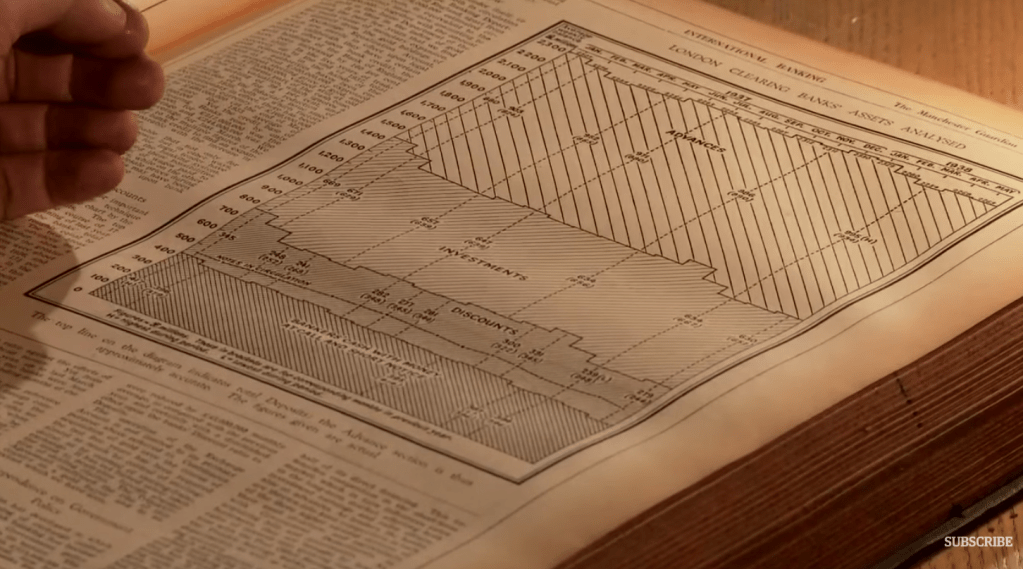
Design has changed over the years to make data easier to read. Graphic design has simplified data to suit the needs of their users.
Most recent design of the Guardian
Part 3
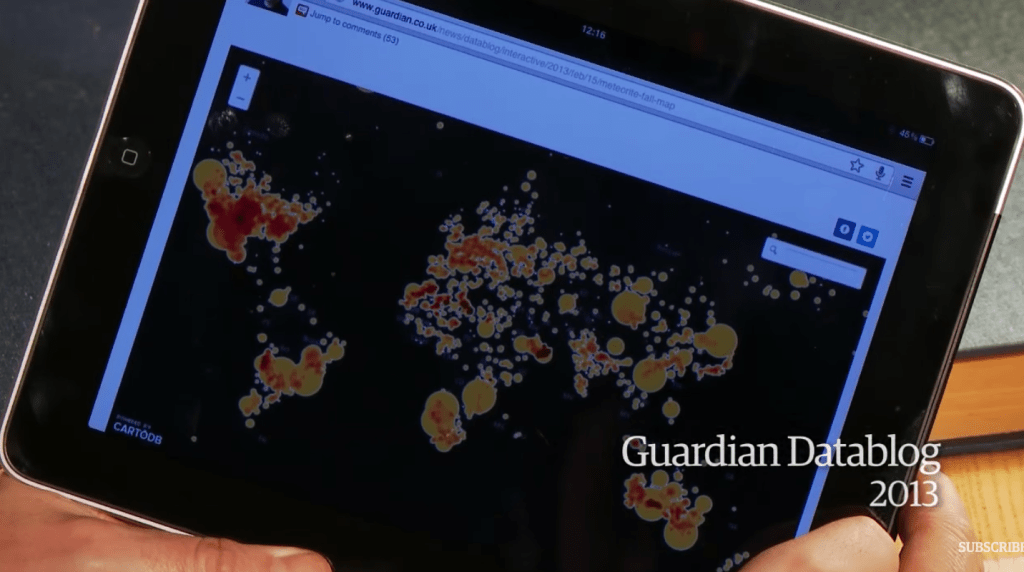
Data journalism in action: the London Olympics
Data journalist needed a way for medals to be shown in a visual way for viewers to compare graphics. They were organised by population and team size so users could aggregate data to their own view.
It was interesting to see the types of stories the audience were creating by either country or the type of sport.
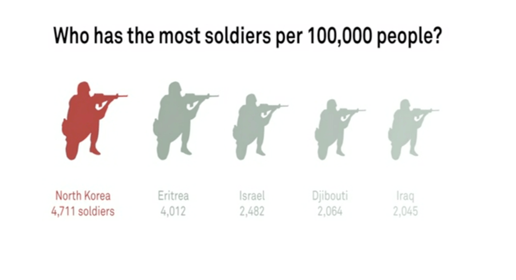
David McCandless: The beauty of data visualization
David Mccandless from Ted Global talks about data and the importance of visualisation. Patterns/texture and colours can create impact the way a user interprets data.
Who has the most soldiers? At first guess, it’s believed china has the most but doesn’t consider that they have the biggest population.
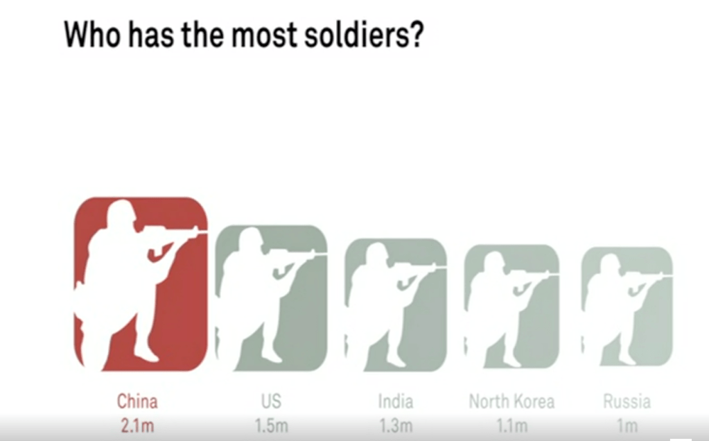
When asking the right questions and taking all data into the right consideration the picture is changed.
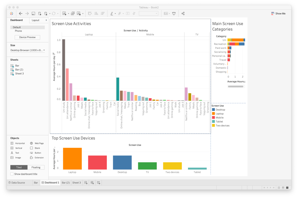
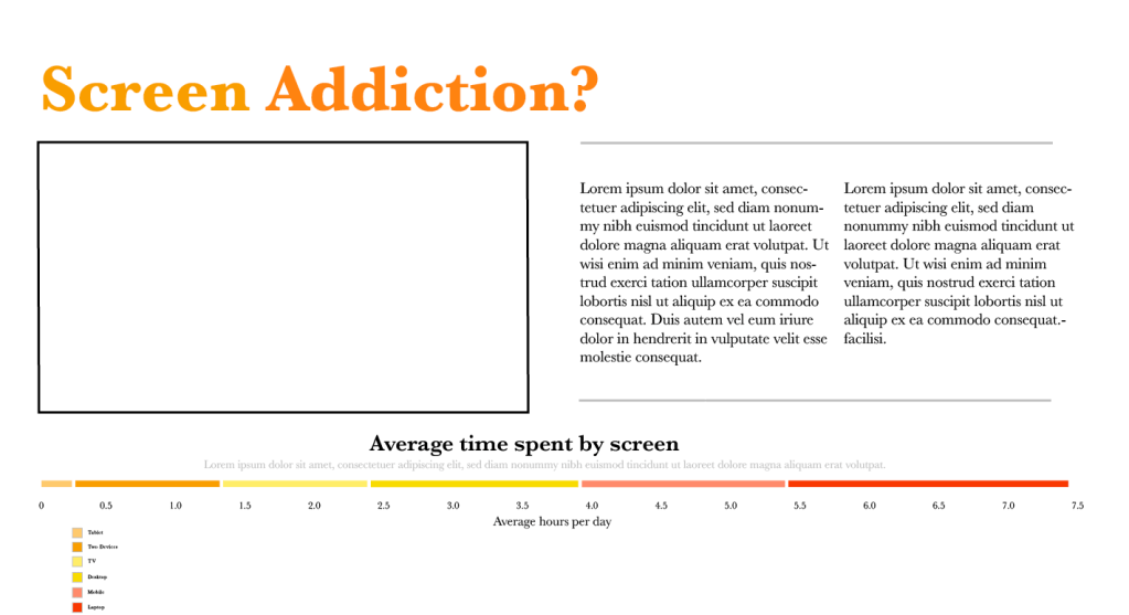
Student Screen Use
The following dashboard shows how students use their time including screen use. The chart below shows the most used screen devices and the hours per day. I also included the category which used the most amount of screen time which was university and recreation. The middle graph shows the types of activities that were used by which screen, i limited the activities to 3 devices – Laptop, Mobile and TV.
Leo Cmielewski
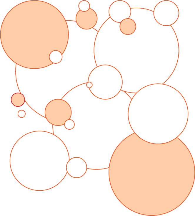
Why we use Graphs? They make comparisons easier by using a range of aesthetics. Shapes or colours eg. Bubble chart
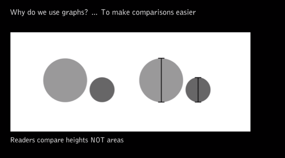
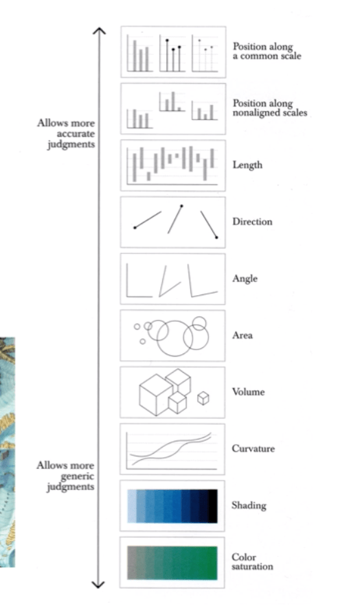
Human Visual Perception is important to presenting data, here is an example of ranking visualising data.
History of O-Ring Damage
It’s important to choose the right type of graphic display as it can affect how severe the issue is.
Bar Chart
Line Chart
Pie Chart
We visualise data to gain insight to understand a complex issues. Creating a visual tool (data visualisation) to simplify hard to read data.
The Functional Art – Alberto Cairo
Comparison between reading data in numbers to visualising in graph form. When trying to find a certain comparison in data, its to memorise numbers and compare this way.
The example is a contemporary data visualisation which gives us the tool to see the whole story and make comparisons of the data.
‘Functional art, that is beautiful and engaging as well as honouring the intelligence and curiosity of your readers’
Nathalie Miebach – Ted Global 2011// The Art made of storms

Pressure wind and temperatures graph of data which were read and played by a musicians to show weather changes from Hurricane Nowell. Each bead and band were read as musical notes to create a melody.
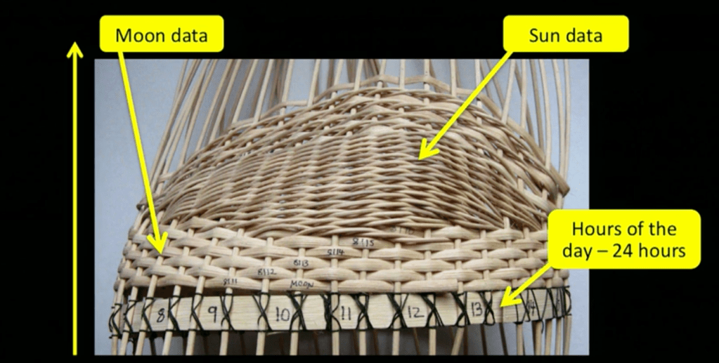
Nathalie uses visual elements to tell data stories using a ‘translation process’. She creates colours and strings to represent numbers and the pattern of temperatures/air and moon phases. Music has made it possible to translate and reveal weather patterns making it an interesting way to visualise data.
Leon Cmielewski
The story of Napoleon’s army heading towards Moscow, starvation and disease while being attacked and defeated by the Russians.
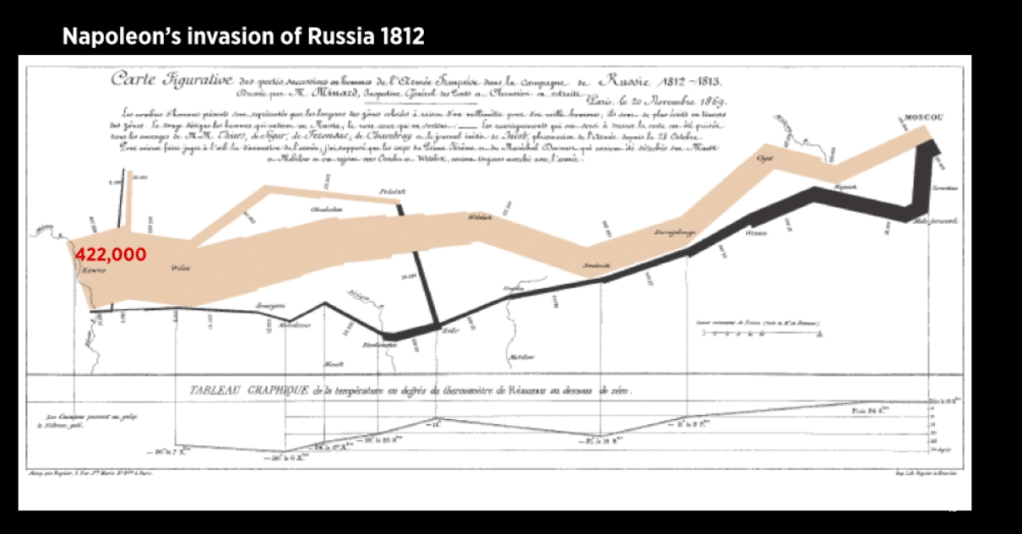
The following is an infographic of the distance between the polish border to moscow – left to right. The diagram displays different variables, indicating the total and strength of the army by the use of line thickness. There is a maximum amount of loss which is seen in the middle when the army crossed the river losing most of their men.
The thin bottom line represents the temperature changing over the period of time – the lowest at -30 degrees celsius to the ‘highest’ zero degrees celsius.
Data Visualisations are able to give ‘tools to be able to analyse and make comparisons for themselves’ You are able to create multiple stories from visualisation like this example shown.
Florence Nightingale Crimean War 1858
The impact of using the wedge made it possible to compare data from over 2 years. Using patterns and relationship between the data.
Otto Neurath 1882 – 1945
Neurath used the system of ISOTYPE – Picture education, the use of multiples of the same size.
‘The means of education through the eyes’
The idea of visual education to represent masses of data.
Assessment 3B Quick Style Guide
Typography
Colour Scheme
Info graphic example style (precedent) + hero image
Basic Data Types
Collecting and wrangling data helps to find the right visualisation for your needs. There are 4 basic levels of measurement – nominal, ordinal, interval and ratio
Nominal – Named categories of which the data is formed (unordered) Super market example. Used to calculate percentage of eg. Canned, frozen, produce, dairy…
Ordinal – Numbers in order, no category has any mathematical data. Any set of ordered number to represent group – numbers interpret end analysis.
Interval – Time of day falls into interval data. Numeric data – eg. 0am isn’t the absence of time but the start of a new day.
Ratio – Time compared, eg. 0 represents absence, nothing of that type
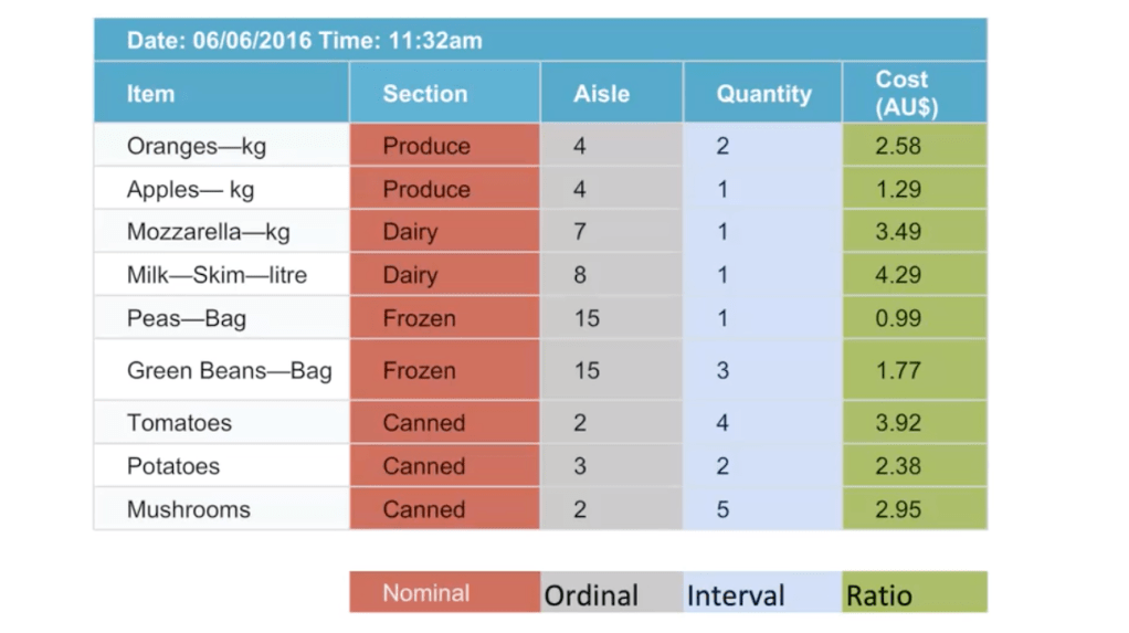
The following is the data types explained in the supermarket example.
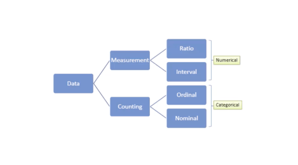
Chart divided into 2 sections, numerical & categorical – useful to define types of data. Naming variables helps to avoid mistakes when reading data.
Visualization is a mass medium, for data visualization which is essential for communicating information and presentation of data.
Data is a measurement of values, either in quantity or qualitive, where it is displayed as graphs or images to create ‘Data Visualisation’ – it is the ‘modern equivalent’ of visual communication. It is information displayed as a schematic form including for units of information.
The aim of data visualisation is to display and communicate ‘graphics, plots or information graphics’
The difference between info graphics and data visualisation?
‘Not all information visualisations are based on data, but all data visualisations are information visualisations’
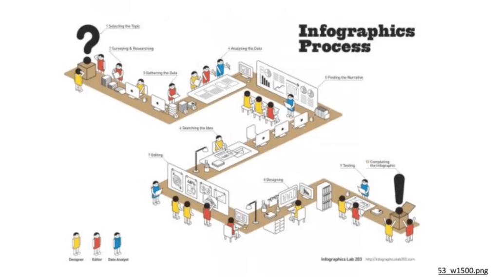
Some infographics are not based on data and are shown as a ‘description of a process’ The following is an example of an infographic showing just a list of steps and picture with no data involved.
The reason for data visualisation is to help users understand complex data, create stories, understand causes/effects and to make comparisons.
‘Processing – Analysing – Communicating – this data presents variety of ethical and analytical challenges for designers’ It’s important to have the right visualisation to the type of things you want to visualise.
