Leo Cmielewski
Why we use Graphs? They make comparisons easier by using a range of aesthetics. Shapes or colours eg. Bubble chart
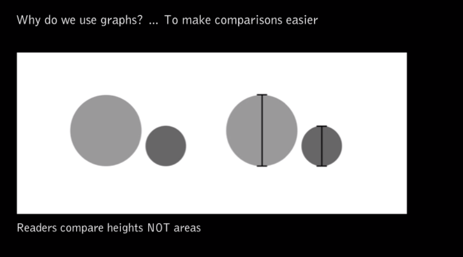
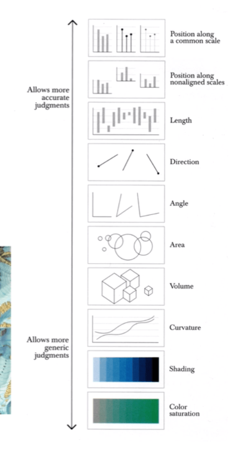
Human Visual Perception is important to presenting data, here is an example of ranking visualising data.
History of O-Ring Damage
- Weak graphics of O-ring damage and temperature
- Fused together into little rockets, unable to show comparison
- Redone as a scatterplot graph shows further information
It’s important to choose the right type of graphic display as it can affect how severe the issue is.
Bar Chart
- Classic and useful – familiarity
- Easy to see trends within data – reveals highs and lows
- Comparison is easy to see and use
- Understood easier
Line Chart
- Easy to see data over time
- ‘Connect individual sequence of values’
Pie Chart
- Relative Proportions (percentages)
- Compare small amounts of data (1-6 proportions)
