Nathalie Miebach – Ted Global 2011// The Art made of storms
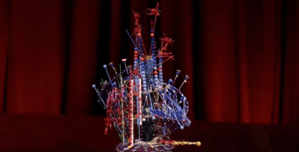
Pressure wind and temperatures graph of data which were read and played by a musicians to show weather changes from Hurricane Nowell. Each bead and band were read as musical notes to create a melody.
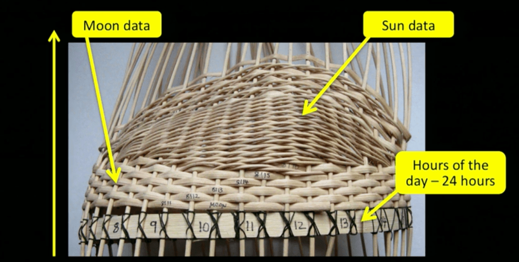
Nathalie uses visual elements to tell data stories using a ‘translation process’. She creates colours and strings to represent numbers and the pattern of temperatures/air and moon phases. Music has made it possible to translate and reveal weather patterns making it an interesting way to visualise data.
