Part 1
The Guardian
Data journalism is a report on data to reveal key information to inform a story. It is the ‘Modern way of journalism’
Visualising to make the data easier to understand and more engaging for the audience
Part 2
History of Data Journalism at The Guardian
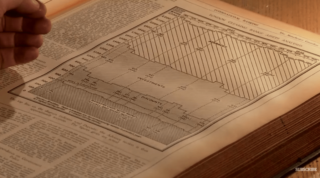
Guardian’s first ‘bound edition’ was published in 1821, which featured a table of contents with organised data of lines, laid out to make information easier to read.
- No photographs used in the first editions
- Graphics were shown as letters and numbers
Line chart example from the Guardian 1938
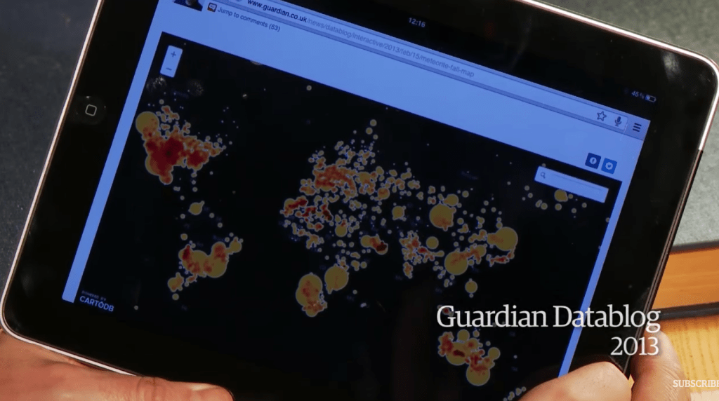
Design has changed over the years to make data easier to read. Graphic design has simplified data to suit the needs of their users.
Most recent design of the Guardian
Part 3
Data journalism in action: the London Olympics
Data journalist needed a way for medals to be shown in a visual way for viewers to compare graphics. They were organised by population and team size so users could aggregate data to their own view.
It was interesting to see the types of stories the audience were creating by either country or the type of sport.
